Website Design.
A selection of projects from clients ranging from opera singers to arts education start-ups to professional choirs.
My experience as a performer in the classical and opera singing world has provided me with a deep appreciation for aesthetics, storytelling, and the importance of captivating an audience. These skills translate seamlessly when designing websites for the creative sector, as I understand the significance of visual appeal, narrative coherence, and engaging user experiences that resonate with the artistic community and their audiences.
Each project is different and I pride myself on a bespoke approach but if I had to distill the process, it would include these vital elements:

DISCOVER
Client meetings
Research
DESIGN
Design ideas
Colour palettes
Website mockups
REVIEW
Present
Receive Feedback
Iterate
Luke Sinclair - Tenor

Overview.
Luke is an opera singer working on the international stage with an exciting diary of events. This project was a redesign of his previous site which was in need of a revamp.
I designed his new site using Figma and Wix.
The Process.
Initial Discussion - discover Luke’s goals and aims
Design mockups - explore competitor space; create potential design options
Agree on design path - meeting to discuss mockups
Implement designs - input pictures, diary, and content.
Review - Luke came back with feedback and iterated the design based on his input.
Added Value.
Luke mentioned the majority of his views are on mobile devices so I paid extra attention to how his site would view on a smaller screen.
Michael Waldron - Conductor

Overview.
Michael Waldron enjoys a varied career conducting orchestras and choirs in the UK and internationally. His website brings together a significant portfolio career of performing and recordings, so I took this into consideration when creating his online presence - MW.com needed to serve as a welcoming, easy-to-use point of reference for potential clients and future colleagues.
I designed his new site using Figma and Squarespace.
The Process.
Initial Discussion - detailed overview of MW’s old website; pinpoint opportunities and scope
Design mockups - explore competitor space; create potential design options
Agree on design path - meeting to discuss mockups
Implement designs - input pictures, diary, and content.
Review - Michael took time to review the site before launch.
Launch
Added Value.
Michael’s extensive recording back catalogue required multiple embedded plugins and links to where users can buy his discs so I explore the best ways to display this online.


Sounds That Carry

Overview.
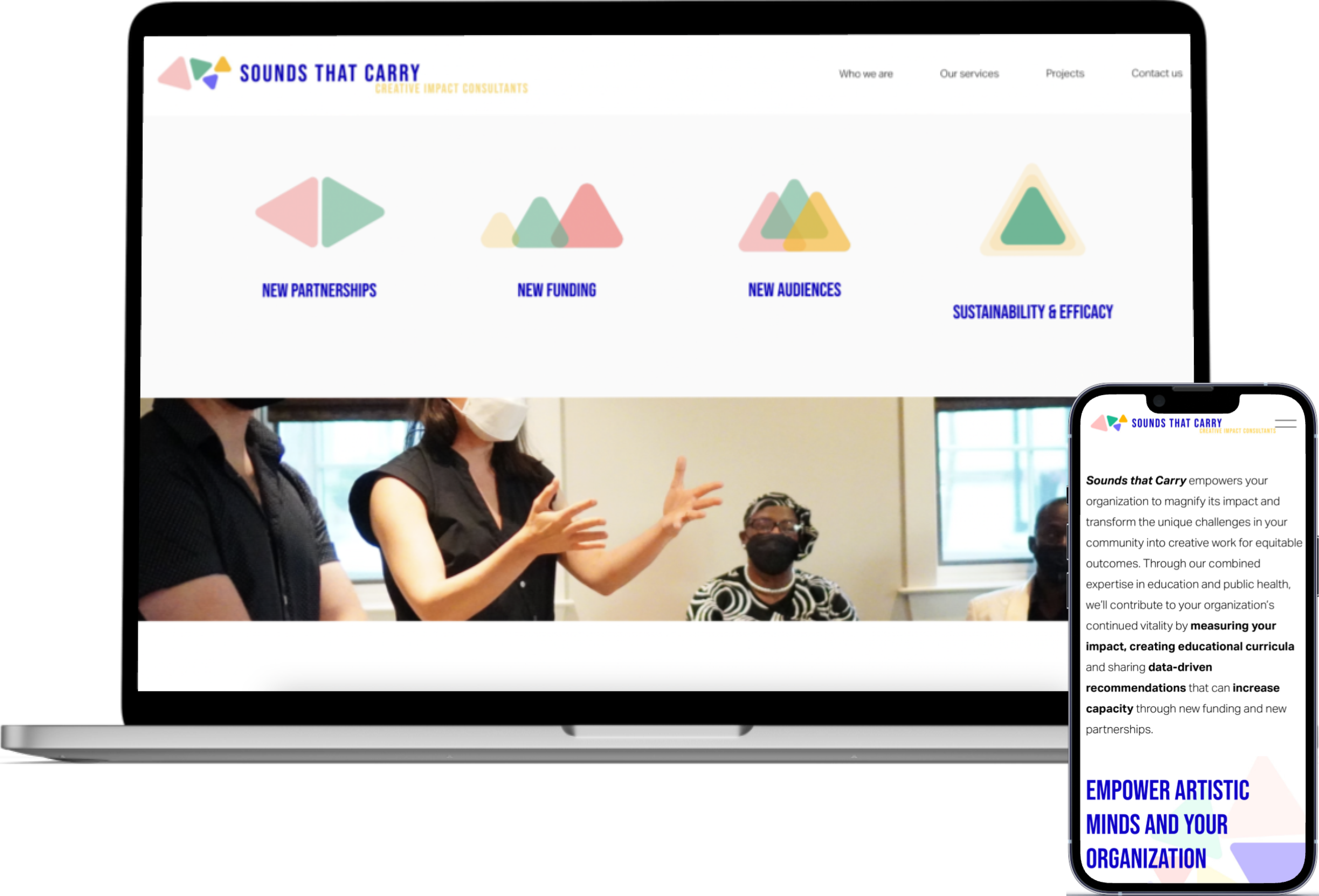
Sounds That Carry is an education consultancy start-up offering a range services to support, develop and disrupt the arts ed sector. The brief was to design a colourful, dynamic online touchpoint for the range of services which STC offers.
I designed this site using Figma and Squarespace.
The Process.
Stakeholder Meeting - discuss project’s scope
Brainstorm - define STC’s services and how to display on website
Market Research - examine similar online sites to gain insight into problem space
Create Design Options - using Figma, design three clear options
Review - stakeholder meeting presenting options
Implement - input client pictures and content
Added Value.
STC wanted bespoke designs which bring to life their company ethos - empowering through creativity, so I designed a soft-cornered triangle motif which is used throughout the site.


The London Choral Sinfonia

Overview.
The LCS is a vibrant professional ensemble, specialising in breathing new life into choral and orchestral music. Their output includes several recordings per annum and an exciting live performance season, so their new site needed feature their work and encourage audience engagement.
I designed his new site using Figma and Squarespace.
Phase 1 is currently live. Phase 2 in progress.
The Process.
Phase 1
Initial Consult - discuss the ensemble’s online goals
Create Design Options - using Figma, design two clear options
Collate - input content-heavy site.
Review - Stakeholder meeting to present site
Launch - take the site live.
Phase 2
Refine Design - rethink fonts, colours, elements
Refine Logo - liaise with graphic designer to revamp logo
Incorporate - apply style guide
Create Brand Guide - guide document for web and print
Added Value.
The LCS needs ongoing support managing upcoming events and tech troubleshooting alongside a second phase of development. Like many sites, it’s a living document of the LCS’ work which is constantly changing.


Want to know more?
